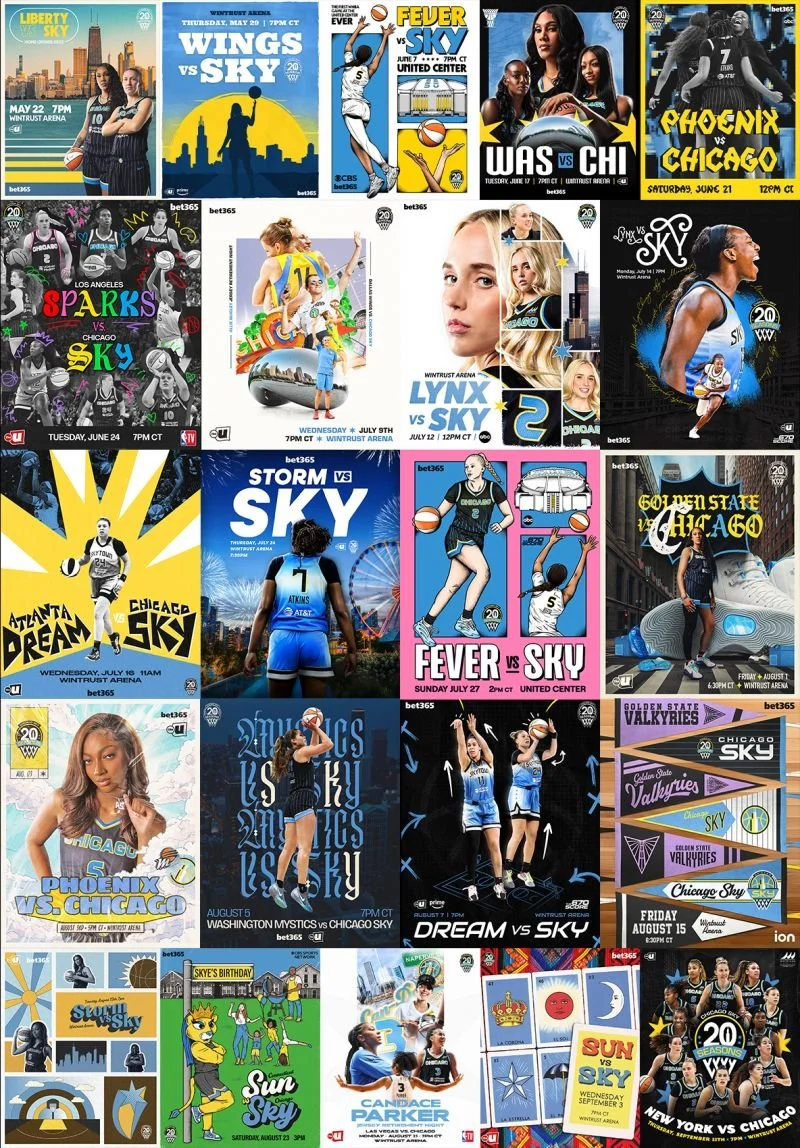
CHICAGO SKY MATCH UP POSTERS PROJECT
This was a project I took a lot of pride in bringing to the team, and I loved that we give these out as exit giveaways at every home game as well. The idea was to have a unique match up graphic for every Chicago Sky home game, as a way to showcase our design teams individual skills and give us a place where we could experiment, try out new styles and get really creative outside of the seasons aesthetics. These could be based of the theme night, players, or the city we were playing that night. The first image is those I created, the second image is the whole collection by the design team, of which I was the creative director.

Trading Card graphics + giveaway project
One of my favorite Chicago Sky giveaways we created this season was for this past Friday's 'Sports Matter' theme game. This idea was born from the Draft Night 'rookie card graphics' I created and also evolved into a ‘Rookie Card Cam’ for game night in-arena. This was a huge undertaking, and each pack included the full Chicago Sky roster. The graphics themselves were inspired by vintage trading cards from the 1980s and earlier.


ALL STAR VOTING 2025
I had the opportunity to lead the creative direction for our 2025 All-Star voting campaign, not only with static graphics, but also crossing over into our video assets and activations. I wanted to play off of a mosiac, mirrored effect as something different and set our campaign apart from other teams in the WNBA.


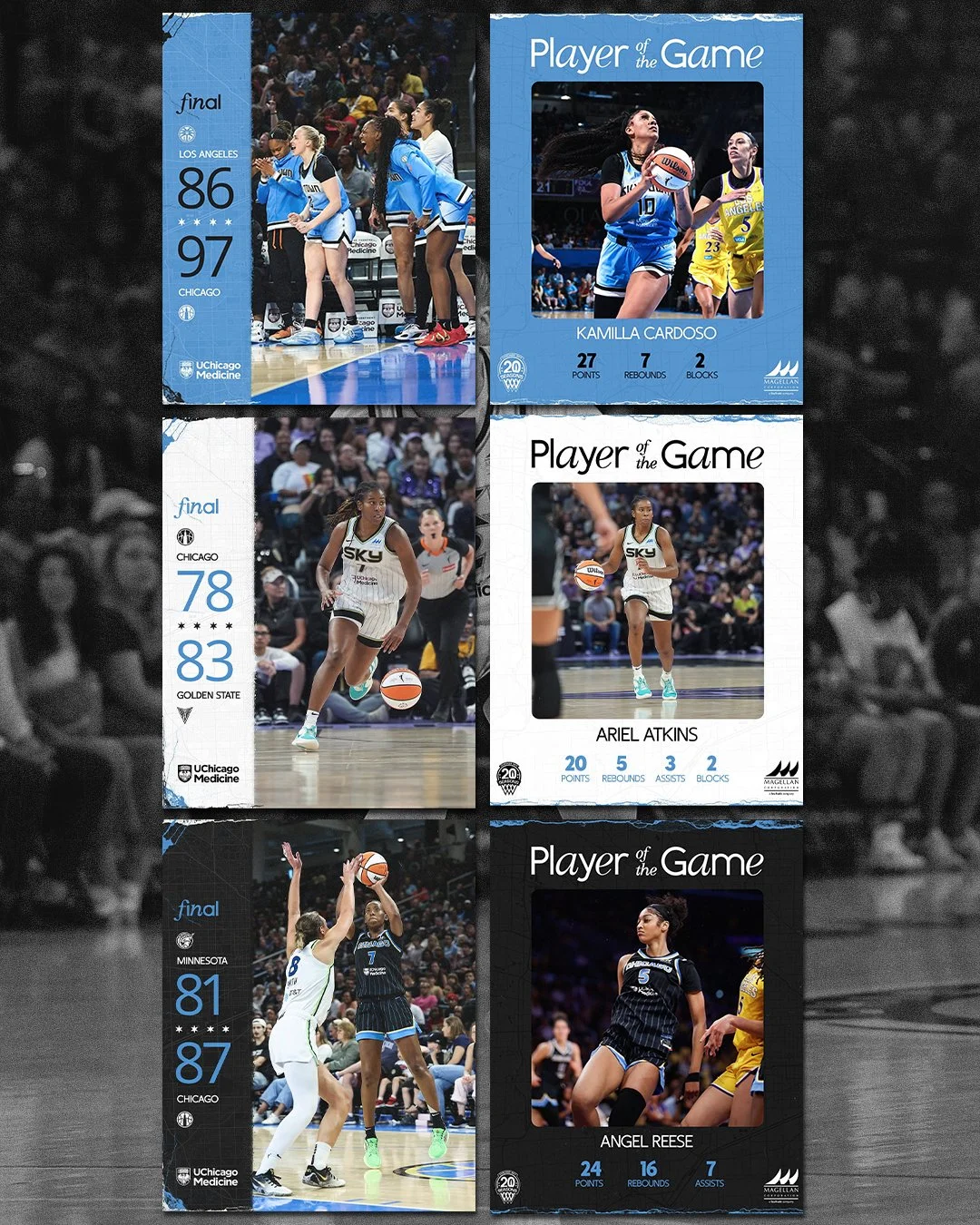
IN GAME GRAPHICS
For this season, part of the creative direction I lead was to match the in-game graphics with the color of jersey the team wore that game. this helped break up our social media grids, and also gave a point of difference which making the graphics themselves look really nice and cohesive. These templates were made by myself, and completed each game by either myself of a member of our design team.
End of year awards campaign graphics
For our end of season awards campaign push, I lead the creative to play off the idea of “roll the tape”/ “play it back” and highlight reels. I wanted to give these a little bit of a retro feel as with a lot of our graphics packages,


2025 Chicago Sky Branding Project
Below is the initial design proposal for the 2025 season aesthetic I created for the Chicago Sky. The concept for this seasons look was to align with the "Glory to the Grind" ethos outlined in the 2025 marketing plan. Chicago is defined by its hardworking, resilient spirit and unwavering determination. It’s a city with a rich, often gritty history, where community and support for one another are core values. Our aesthetic for 2025 should reflect these qualities, embodying both the strength and authenticity that characterize the city and its people. The design for 2025 also marrys old and new, with combo of textures and contemporary font pairings.

United Center Game graphics
I wanted to make a unique look for these special games as they were the first WNBA games to ever be held at the United Center. I played off of the 4 stars on the Chicago Flag, and off of the textures we used in the rest of our 2025 graphics but with a bit more of an edge. I wanted these to be eye catching as they would be used across various platforms including in-arena at the United Center during Chicago Bulls games and concerts leading up to the WNBA games themselves


Tomorrow Never Knows festival 2024 branding and artwork
Every January Audiotree holds a multi-venue festival named Tomorrow Never Knows.
I am in charge of creating unique branding and artwork for the festival each year, that not only captures the essense of the festival being a music discovery platform for smaller artists, but that also keeps up with design trends and aesthetics. Above is a selection of different images from the 2024 Festivals branding suite- from GIFs for the website, to individual artist graphics to full line up stature graphics and branding guide. This is something I have SO much fun with each year, and is one of my biggest undertakings as planning for the festival begins 6 months prior each year.


Audiotree Album cover art
One of my biggest projects as Art Director at Audiotree was to rebrand the album artwork for our live sessions.
This involved choosing a typeface that encompassed all genres, and also shaowcasing my photo editing skills with the band portraits we take at the end of each live session. What we ended up with is something I am incredibly proud of, that looks slick, clean, and helps showcase the artists front and center.


LOGO DESIGNS
Various logos i have been asked to create both at Audiotree and in my freelance work. Chicago Music Scene is a non-profit organisation, Mint Chip is Audiotree’s work-for-hire production company. The Schubas logo was created for our well loved Chicago venue, based off the iconic neon sign outside the bar.


